- FREE SHIPPING On all orders
- SUPPORT 24/7 We support online 24 hours a Day
Call Us Now
888-395-0493
or chat online
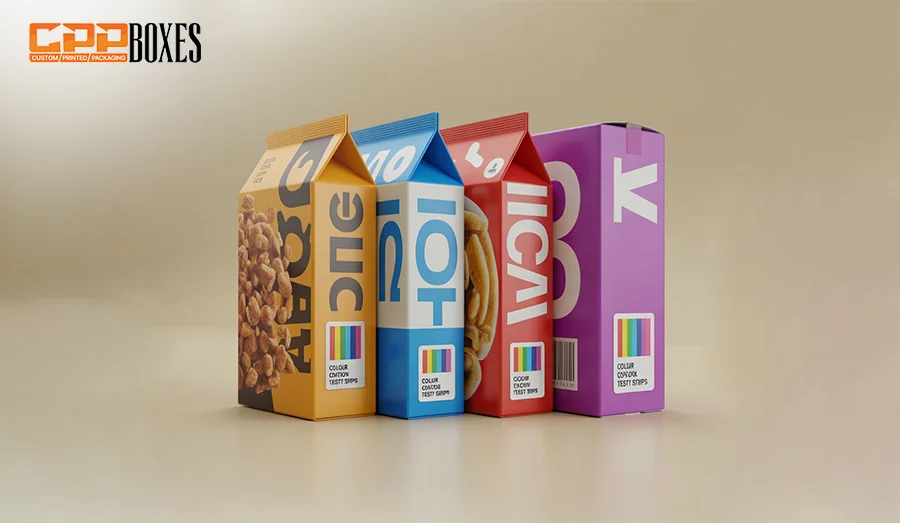
Packaging trends and strategies are continuously evolving. That’s the reason: we come across several innovations in custom packaging solutions every day. Currently, the brands’ focus is shifted to increasing and strengthening interaction with consumers. Random colors on the back of the product’s packaging are one of these innovations. Whether you flip a cereal box, a snack wrapper, or a toothpaste tube, a fascinating row of colorful dots, bars, or blocks appears. You might have noticed that these marks usually appear near the product information, barcode, or along the edges of the packaging.
It clearly indicates that these random colors are not just a decorative element of the packaging. They have some practical purpose to meet the advanced technical needs of the modern era. In this blog, we’ll uncover these facts and explain why these dots are in demand in almost all industries. What unique functions do they serve, how are they created, monitored, and evolved over time? So, stick to this detailed guide post and discover the science and strategy behind these seemingly trivial marks.
Serving various technical functions and marketing quality assurance, the unique colors on packaging are often referred to as:
· Color control bars
· Printer’s marks
· Process control patches
· Color bars/ Color strips
· Test patches
· Press control strips
· Quality control marks
· Printer’s test blocks
· Process strips
· Spectro strips
All these names are based on their specific usage and practicality. The prime purpose of these colors is to maintain a professional, high-quality, and fully consistent printing across all products.
Depending on the shape and placement, the colors on the back of a custom product packaging usually appear as solid circles, bars, or squares. Multi-colored rows, featuring Cyan, Magenta, Yellow, and Black, also often appear on the box. Besides this specific color scheme, you can also go with a custom color pattern. Coca-Cola uses red, its brand-specific spot color, for this purpose.
Color control bars or printers’ test blocks are not part of consumer-facing designs. They are typically located on parts of the packaging that are meant to be trimmed or hidden during the finishing process. However, these marks may remain visible and eye-catching on certain packaging items, such as shrink sleeves, wraps, tamper-evident seals, and other such options.
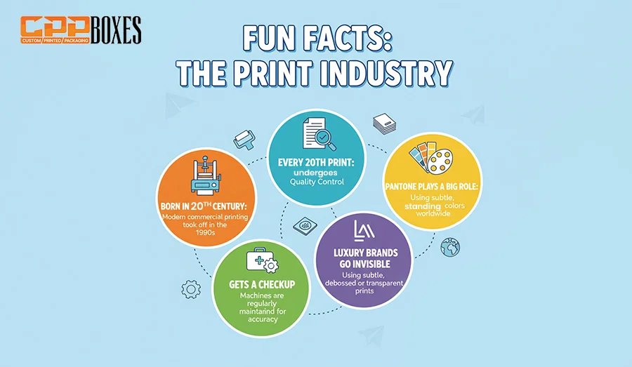
| Fun Fact | Why It Matters |
| Born in the 20th Century | Color control bars originated with analog offset printing — a clever invention that’s still essential for modern packaging. |
| Every 20th Print Gets a Checkup | In many factories, automated cameras scan every 20th sheet to fine-tune settings in real-time, keeping colors perfectly consistent. |
| Luxury Brands Go Invisible | Some premium brands use UV-only color bars — invisible to the naked eye — so packaging stays flawless but still passes quality checks. |
| Pantone Plays a Big Role | Pantone provides custom swatch guides for color verification, helping ensure high-end packaging projects stay on-brand and visually perfect. |
Being the control bars, these colors are checked by printers to serve as a reference point for:
Let’s look into all these factors one by one:
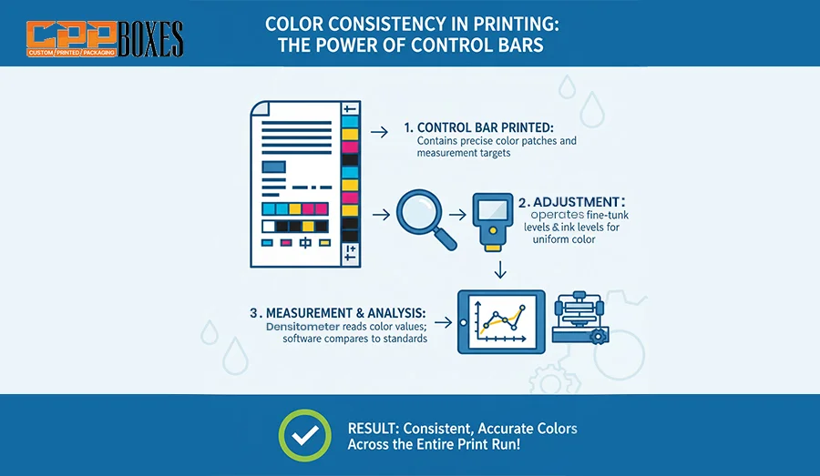
In a mass production of custom-printed packaging solutions, retaining consistency is essential to build a brand’s strong image. These color patches are designed for this purpose. They allow press operators to monitor how consistently a brand’s specific shades are being printed through the entire run. For example, if a red color on food packaging shifts to purple, these marks have the potential to detect it immediately. By early detection, you can easily eliminate the errors and come up with highly professional packaging solutions every time.
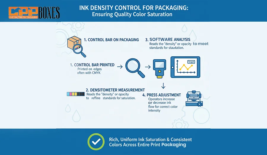
It’s important to maintain ink density within specific ranges. Too low or too high results in damaging the overall outlook of the packaging. Too low ink density makes the colors washed out and a higher density leads to smudging and extended drying time. Densitometers or spectrophotometers are used to scan these patches and give real-time feedback.
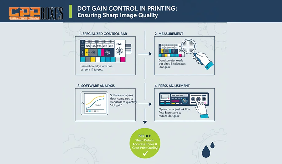
Do you know that printed images are made up of small-sized dots? These dots, when aligned and combined together, result in a professional yet attractive printed image on the box’s surface. When the ink is applied to a paper, it can grow. This process is called dot gain. Color patches have a beneficial role in this regard as well. They help monitor the creation of dot gain and manage it professionally to avoid printing issues. This way, businesses can easily maintain image sharpness and tonal range.
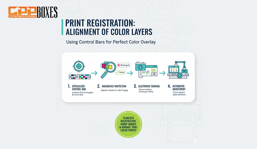
Have you ever observed that most of the packaging designs are a combination of 4 base colors, Cyan, Magenta, Yellow, and Black? That’s the CMYK color scheme, where all these 4 colors are perfectly and professionally aligned together to give a high-end visual appeal. If these colored layers are not aligned perfectly, they give a blurry or double-vision effect. To avoid this issue, registration marks come into play. Often called crosshairs or alignment marks, these marks ensure that each layer is perfectly aligned on the packaging surface.
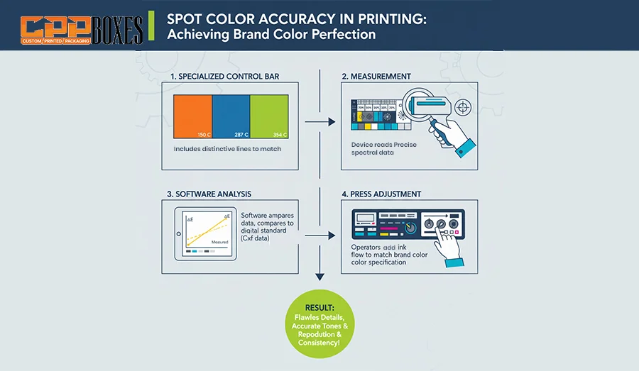
Other than CMYK color printing, many brands go with the spot color printing option. Unlike CMYK mixing, these brands use specific hues, such as Starbucks green or Tiffany blue. Such inks require precise control for maximum results. Color swatches on the print layout help verify these spot colors and reproduce accurately.
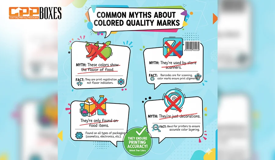
Let’s disclose some common myths about test patches. A few of them are shared here:
| Myth | Reality |
| These colors show the flavor of food | ❌ Not true — they’re only used for printing quality checks, not to indicate flavor. |
| They’re used by store scanners | ❌ Scanners read barcodes, not color dots or bars. |
| They’re only found on food items | ❌ They’re used across many industries, including cosmetics, electronics, and pharmaceuticals. |
| They’re just decorations | ❌ They serve a technical purpose — helping printers ensure color accuracy and alignment. |
Unlike other printing methods, the color marks are not added as an afterthought effect. They are already integrated during the designing and pre-press process. It usually takes 3 steps to create perfect, professional, and functional color marks. These 3 steps are described below. Have a look at them for a better understanding:
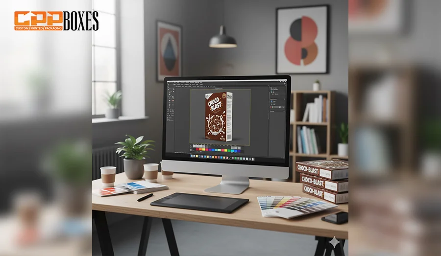
Being the first step in creating colored marks for a product’s packaging, professional graphic design and layout preparation lay the foundation for how the packaging will look, how colors will appear, and how consistent the final product will be across all product batches. Professional designers use advanced design software, such as Adobe Illustrator or InDesign, to create a perfect packaging artwork.
With these tools, they ensure that every detail aligns with the brand’s identity, product specifications, and unique printing requirements. Colored marks are strategically placed on the back of the packaging during this design stage. The marks are not visible to the buyers but are essential for printers to verify color accuracy and bar alignment during the production process. The professional process includes the following steps:
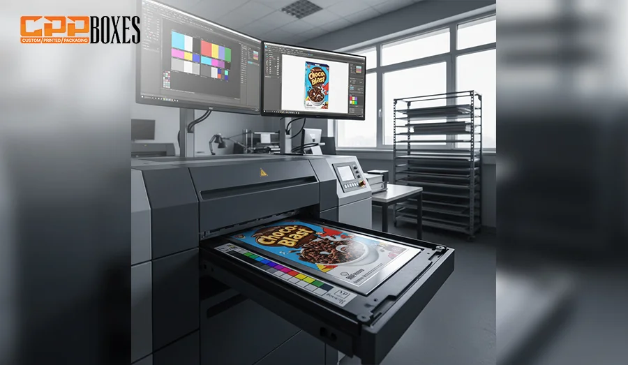
When graphic design and professional layout are finalized, the next step, “plate preparation & color separation,” comes. Being one of the most crucial steps, this phase ensures that every color, line, and detail is perfectly and accurately conveyed onto the packaging material. Color Separation, the technical step, gives you a proper breakdown of the design into its printing components.
As you know that a packaging is usually printed with the CMYK color model and some additional spot colors, this step ensures that each color in the design is perfectly separated into its respective layer. This leads to the precise, accurate, and professional artwork production by printers. The Color Separation technique is further followed by the Printing Plate Preparation. In this step, each color is transferred onto a separate printing plate, typically made up of aluminum or photopolymer material. Here’s the breakdown of key activities involved in this step:
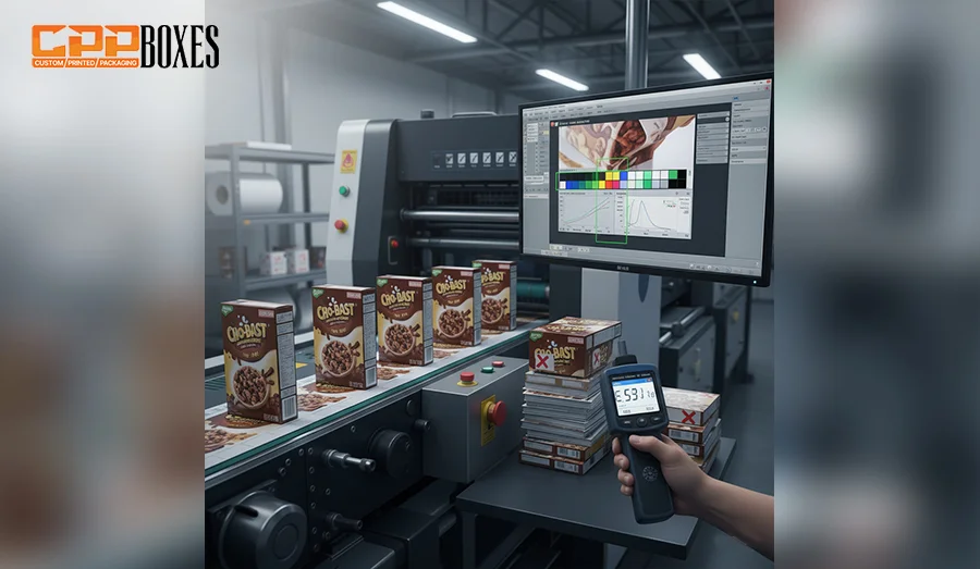
At last comes “Print Monitoring”, the actual printing stage. It ensures that colors, registration, prints, and overall design quality are well-maintained and managed. During print monitoring, the colored marks are professionally and perfectly placed on the back of the product’s packaging. Press operators then measure and evaluate these marks. They check whether the inks are applied perfectly, in the right density, alignment, and balance across all packaging units or not. This leads to the creation of highly professional and attention-grabbing prints.
The step is vital because even a small oversight can lead to thousands of defective packages. By using colored marks as a control tool and constantly monitoring the print process, packaging manufacturers ensure that the final product is both visually appealing and technically precise, maintaining consistency across all production volumes. The following aspects are typically included in this step:
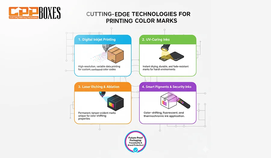
Modern printing systems integrate these color marks with digital workflow tools for smarter, more efficient quality control:
| Tool / Technology | How It Works | Key Benefits |
| CIJ (Continuous Inkjet) Printers | Uses a continuous stream of fast-drying ink droplets to mark colors or codes directly onto packaging materials. | High-speed printing, adaptable to various substrates, cost-efficient for high-volume runs. |
| TIJ (Thermal Inkjet) Printers | Uses heat to eject tiny ink droplets for precise, high-resolution color marks. | Crisp and clean printing, minimal maintenance, ideal for small codes or color identifiers. |
| Laser Marking Systems | Uses laser beams to engrave or discolor surfaces to create permanent color-coded marks. | Tamper-proof, chemical-free, and highly durable markings. |
| Digital Color Label Printers | Produces high-resolution, full-color labels with integrated color codes or bars. | On-demand printing, customizable designs, quick turnaround. |
| Flexographic Printing Presses | Transfers colored inks through flexible plates for consistent coverage over large production runs. | Cost-effective for bulk printing, excellent color reproduction. |
| UV Inkjet Printers | Instantly cures ink with UV light to create smudge-proof and vibrant color marks. | Ideal for non-porous surfaces, environmentally friendly curing process. |
| X-Rite eXact & i1 Pro | Professional handheld spectrophotometers that measure color accuracy and consistency. | Ensures exact color matching across production batches. |
| Techkon SpectroDens | Combines densitometer and spectrophotometer for real-time press-side color scanning. | Live feedback for color adjustments, reducing waste and downtime. |
| EFI Fiery® Servers | Digital front-end (DFE) servers that manage and optimize color output on digital presses. | Consistent, accurate color management across devices and workflows. |
| Heidelberg Prinect | End-to-end workflow solution integrating prepress, press, and postpress processes for color control. | Automated color management, improved efficiency, reduced errors. |
| Vision Inspection Systems | Scans printed packaging to verify color marks and quality consistency. | Detects color deviations, ensuring reliable output before products ship.1 |
Almost all industries in the world use printed packaging, featuring colored marks. However, the following 3 are highly renowned for offering products in custom packaging with colored marks at the back. Let’s have a look at them:
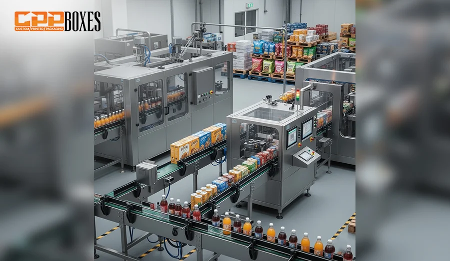
Whether you buy a cereal box, a snack pack, or any other edible product, you might have wondered what are colored dots on food packaging are. They are nothing but the color-control bars to ensure color accuracy and the brand’s recognition. Specialized inks are used to create food packaging colored dots because ink quality is highly crucial. It affects the legibility of ingredients, allergens, and expiry dates. Here’s a breakdown of common colors on the food packaging and their probable meanings:

This industry is a hub of premium and top-quality products. As it’s the place where you often come across high-end packaging, the requirement of precise color matching and premium finishes is completely understood. Holographic elements, metallic inks, matte, or gloss contrasts add complexity to the packaging design. That’s why color codes on the back of the packaging are compulsory. They help verify special effects, such as spot UV coating, embossing, and foil stamping. Below are some reasons that explain why color bars on the back of cosmetic packaging are required:
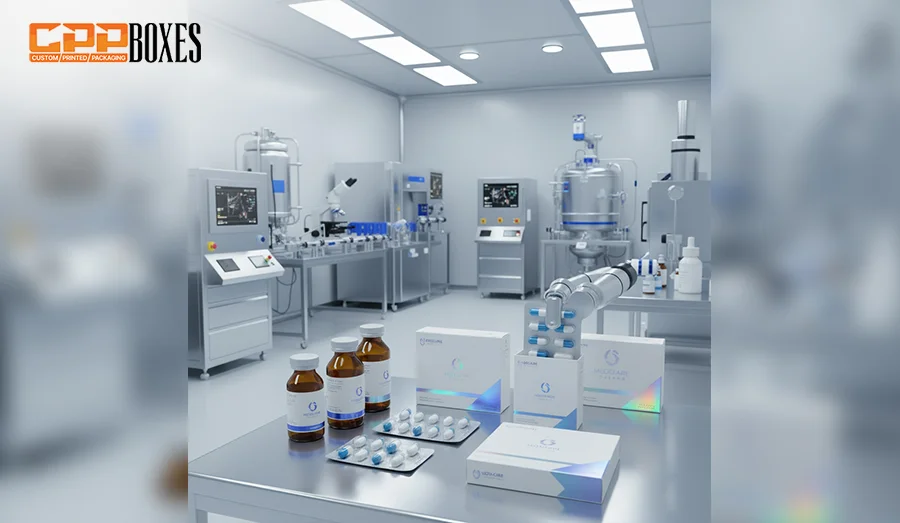
Medicine packaging is one of the most critical aspects in the world. That’s the reason the pharmaceutical industry is one of the most sensitive and strictly regulated markets in the world. Whether they are dosage instructions, expiry dates, composition formulas, warnings, or any other detail printed on the box, it must be absolutely clear and error-free. To maintain this precision and accuracy, colored codes and bars are often printed on the back or side of pharmaceutical packaging.
So, next time, when you see a row of colorful bars and dots on a snack wrapper, shampoo bottle, or any other packaging, remember that they’re not normal. They are far beyond meaningless decorations; they are the reason behind the accurate look of your branded products. From color accuracy to print alignment, these tiny patches play a huge role in keeping packaging consistent, professional, and brand-aligned across the globe. At CPP Boxes, we are highly aware of this fact. That’s why our professional packaging designers and engineers go above and beyond to create fully customized packaging solutions with color control bars at their back. Contact us at 888-395-0493 or quotes@cppboxes.com and get wholesale boxes with free shipping and fast turnaround facilities.
This design offers good protection and a premium unboxing experience.
GET YOUR QUOTE
.webp)


Blake Harper is an experienced and dedicated packaging engineer with a deep passion for creating innovative, sustainable, and cost-effective packaging solutions. He holds a degree in Packaging Engineering, where he gained a strong foundation in materials science, product design, and manufacturing processes. With years of hands-on experience, Blake has honed his skills in optimizing packaging designs for a wide range of industries, including consumer goods, electronics, and food packaging.
Currently, Blake has been with CPP Boxes, a leading packaging solutions provider, for several years, where he has played a key role in designing packaging that balances functionality, cost efficiency, and sustainability. His work at CPP Boxes has involved designing protective packaging, improving supply chain logistics, and developing eco-friendly solutions that reduce waste and environmental impact.
Blake's expertise lies in selecting the right materials, creating structural designs that maximize protection and minimize costs, and ensuring that packaging meets both consumer expectations and industry standards. His approach integrates creativity with technical know-how, always striving for solutions that are both practical and innovative.
Passionate about environmental sustainability, Blake is always exploring new ways to incorporate eco-friendly practices into his work. He is committed to advancing packaging technologies and methodologies that reduce waste, improve recyclability, and contribute to a more sustainable future. Throughout his career, Blake has become known for his strong problem-solving skills, attention to detail, and his ability to collaborate effectively with cross-functional teams to meet project goals.
As stores change their rules about how customers can shop in them, ...
February 8, 2025
Macarons are very delicious colorful cookies that are filled with c...
February 8, 2025
Whether competing online or in physical retail stores, high brand v...
February 8, 2025